Carmeuse was redesigning its control room for limestone processing in Kosice (Slovakia), including both its physical and digital architecture. My team was responsible for designing the physical layout of the screens and the interfaces for production units and an overview screen.
Our goal was to create sober interfaces that can provide situation awareness at a glance, with faster reaction times to abnormal situations and more fluent navigation between units and subsystems.
Lead a team of 3 UX and UI designers
Project management
User research
UX/UI
Our research plan included the following activities:

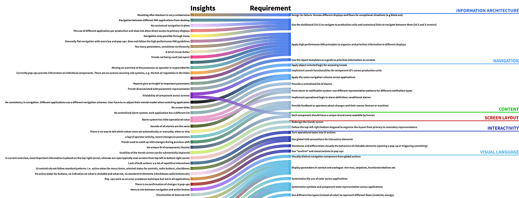
We organised all the insights gathered with a reference to their source in an Airtable database, and organised them in the following themes:
We used the same themes to define design requirements, thus creating a clear link between design requirements and research findings.
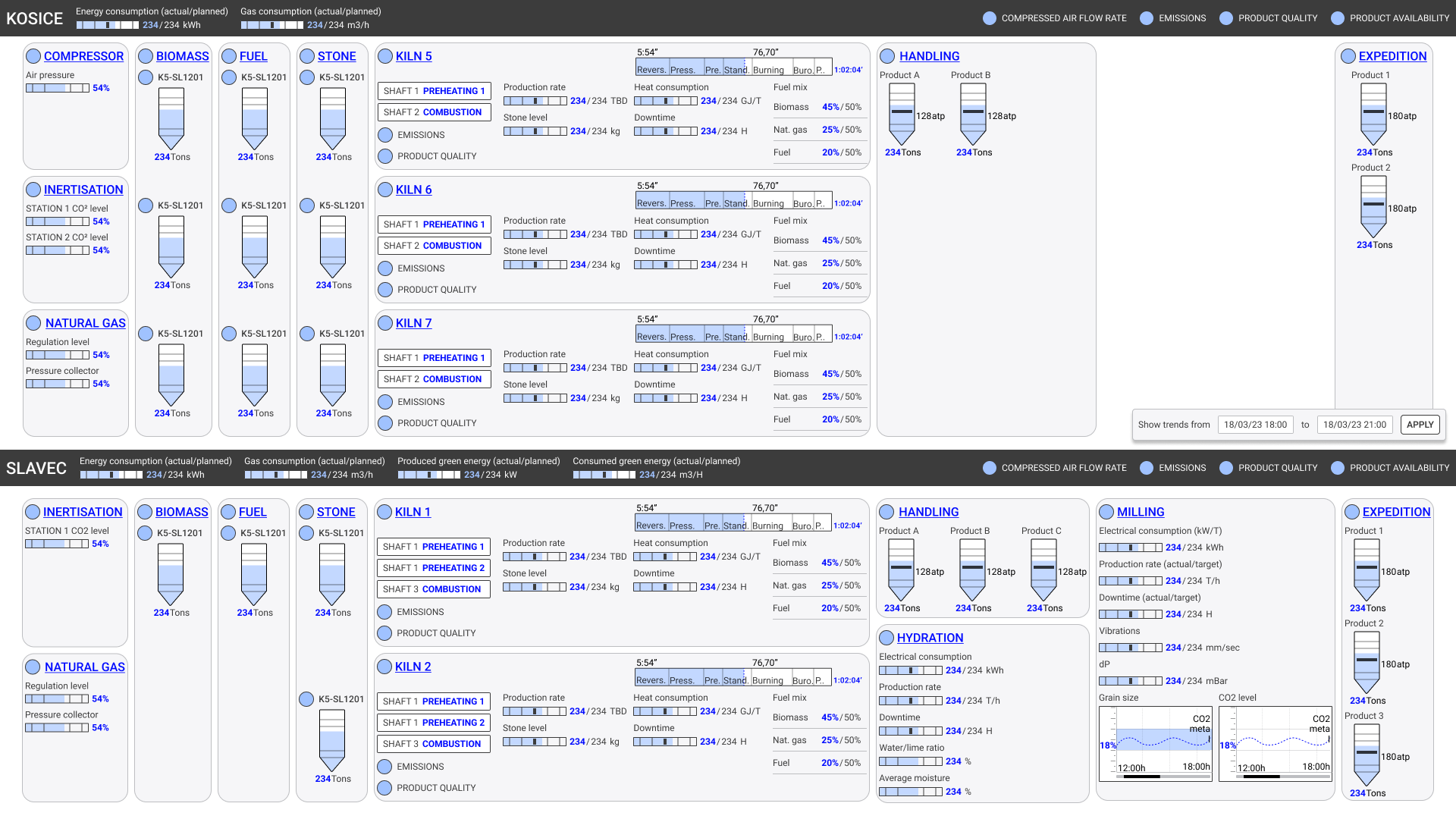
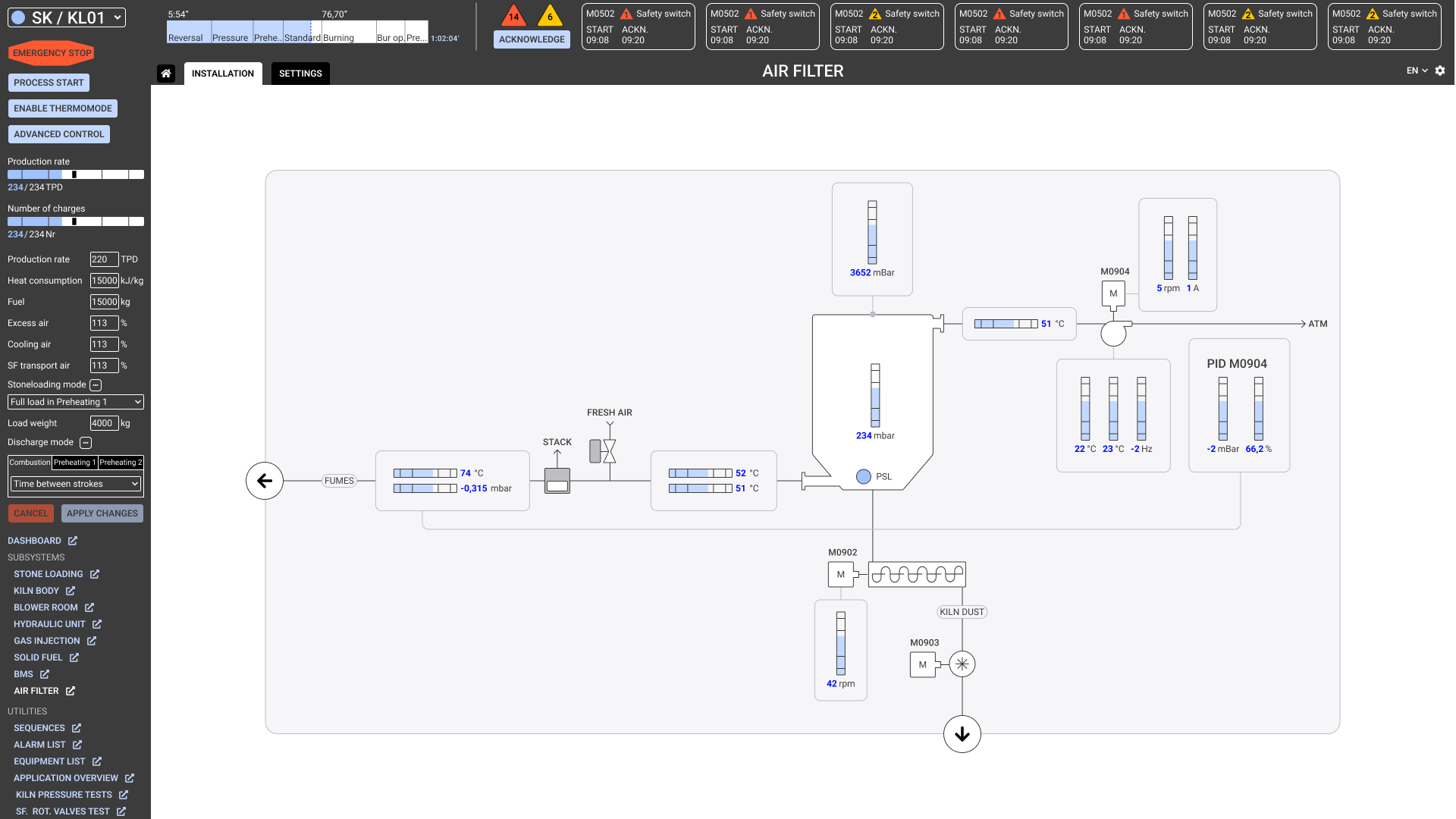
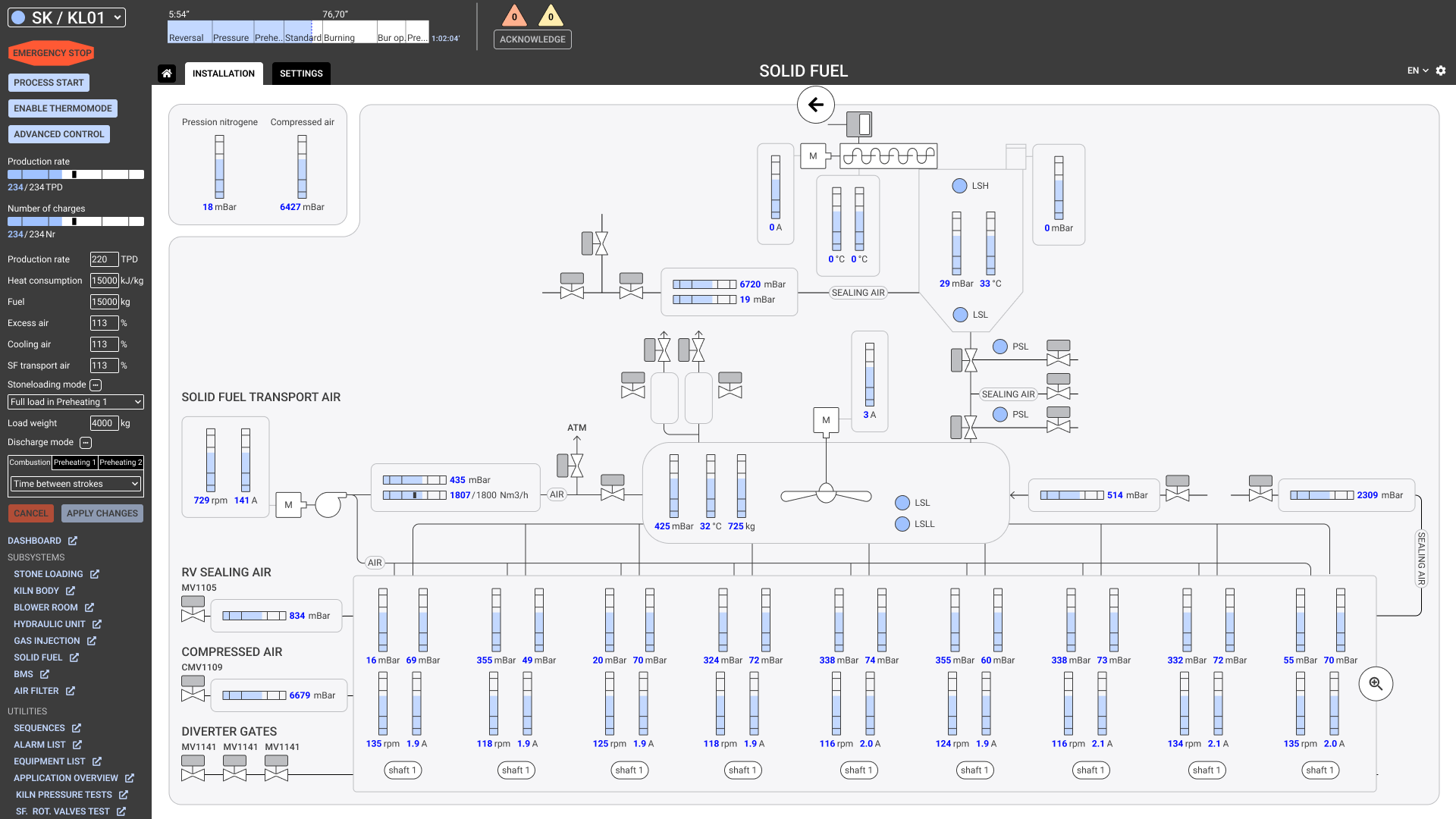
In this project, UX covered navigation, physical and application screen layouts and design direction. I organised the work in design sprints, each sprint addressing some of the design requirements on these topics. Key moments of our sprints were design workshops during which we presented each other ideas and brainstormed on specific challenges.
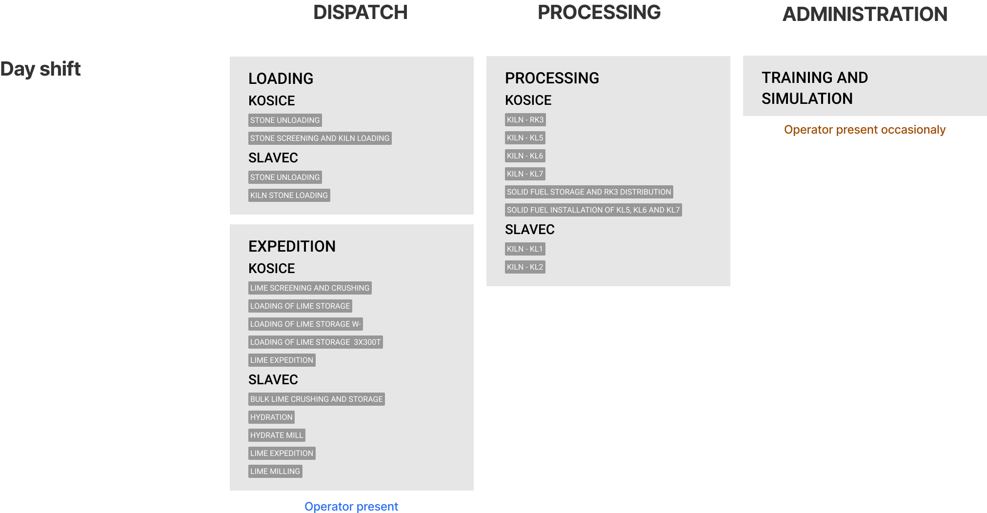
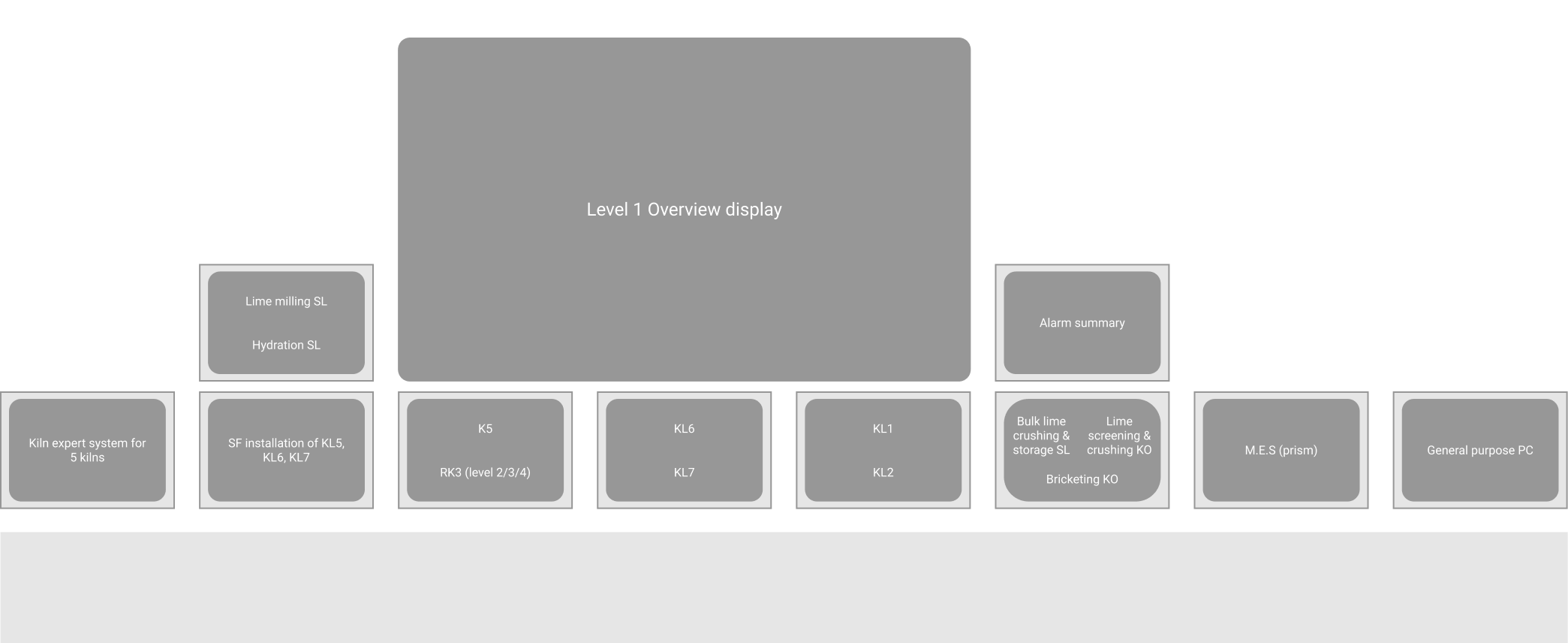
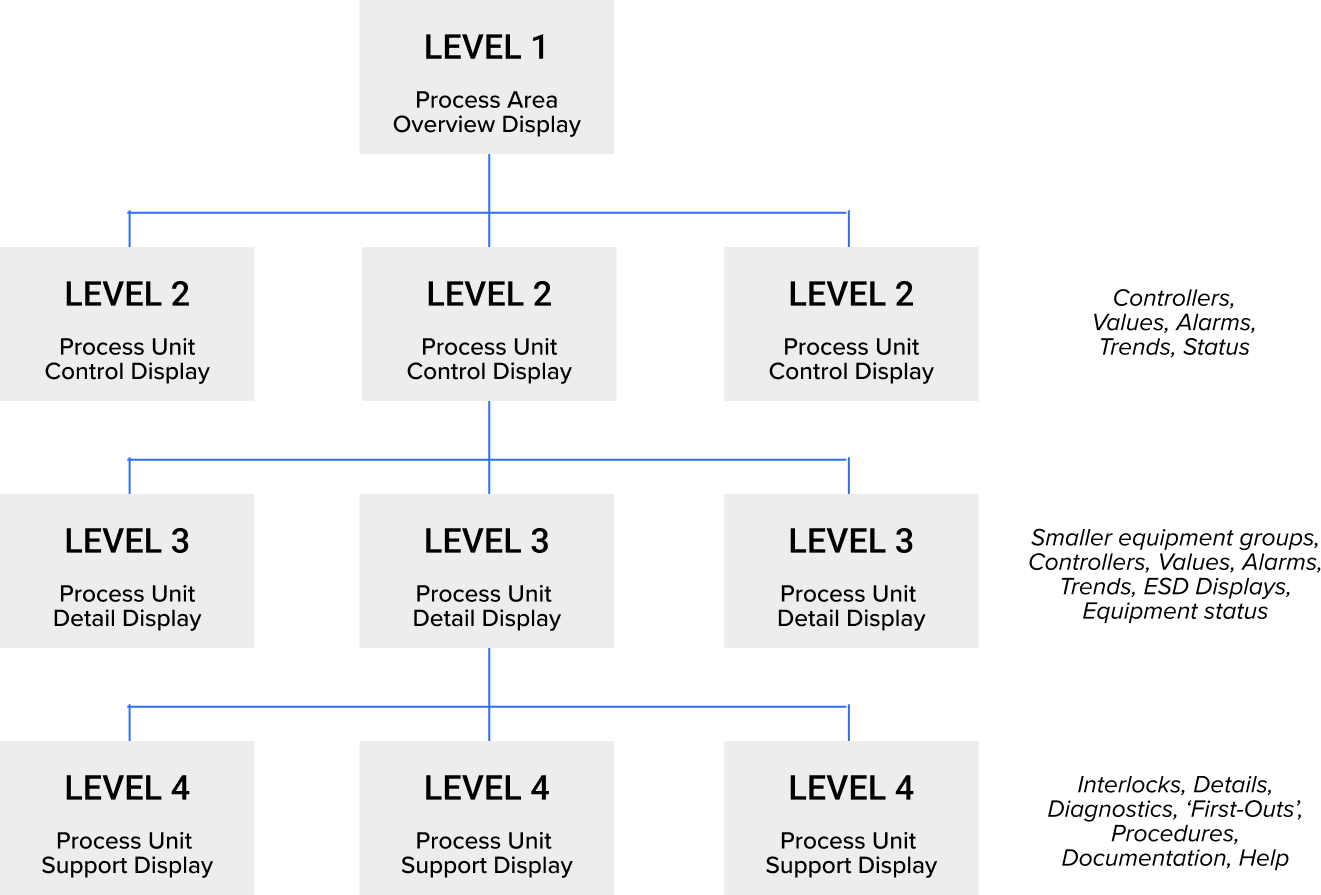
The specificity of designing control room applications is that the entire room is the interface. Information organisation starts in the physical space. Drilling in the information hierarchy brings the user attention closer to a single screen.
Control room experience design entails:
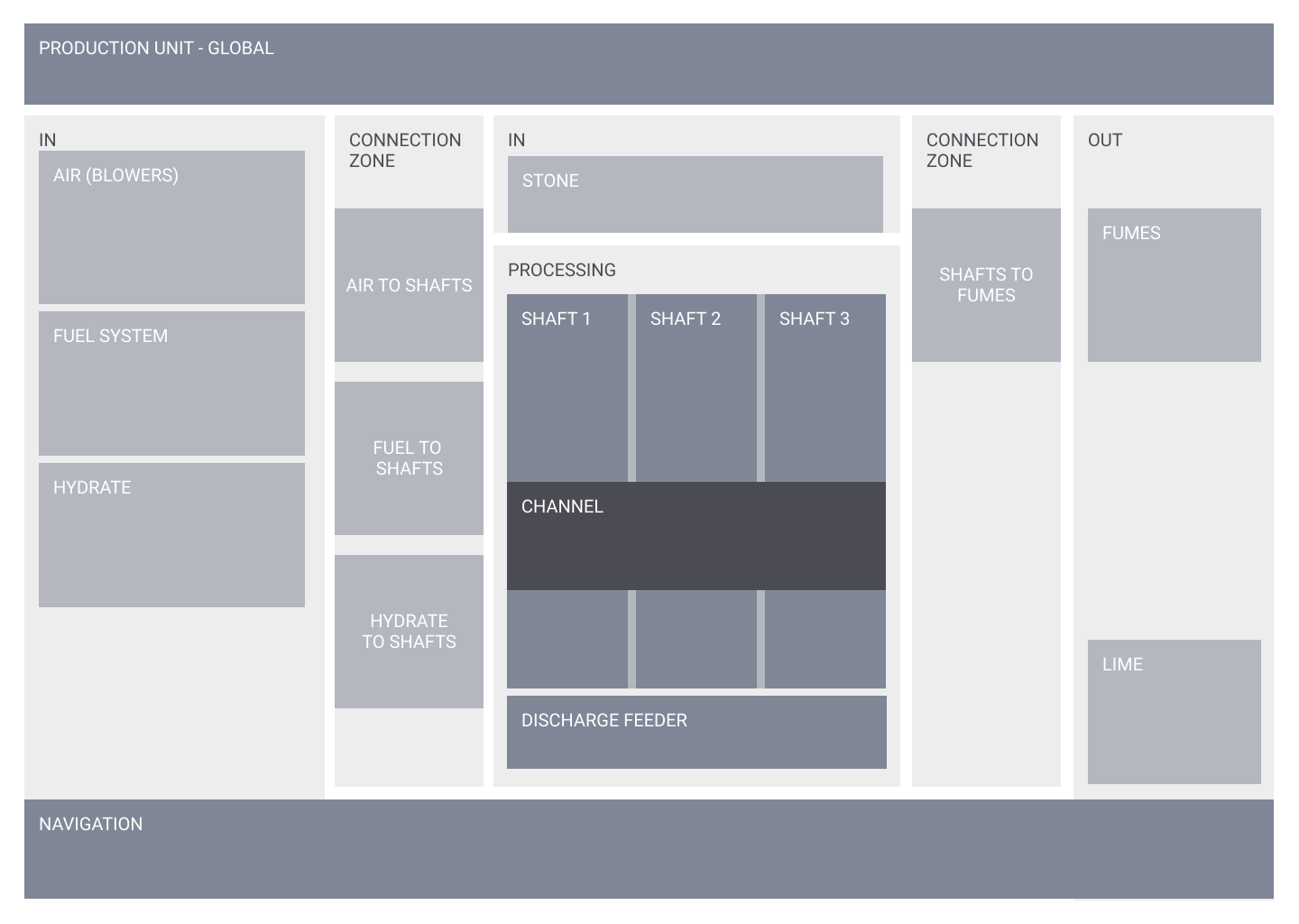
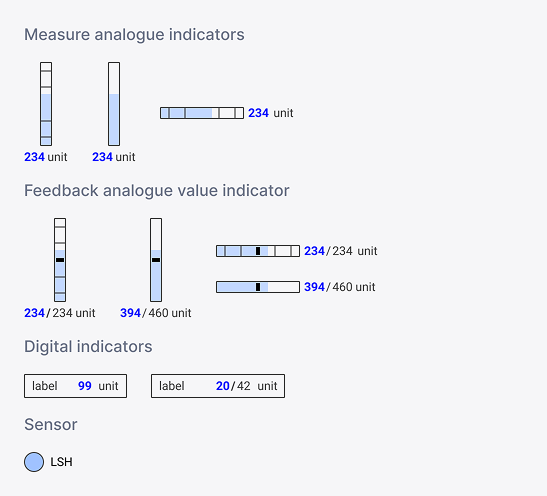
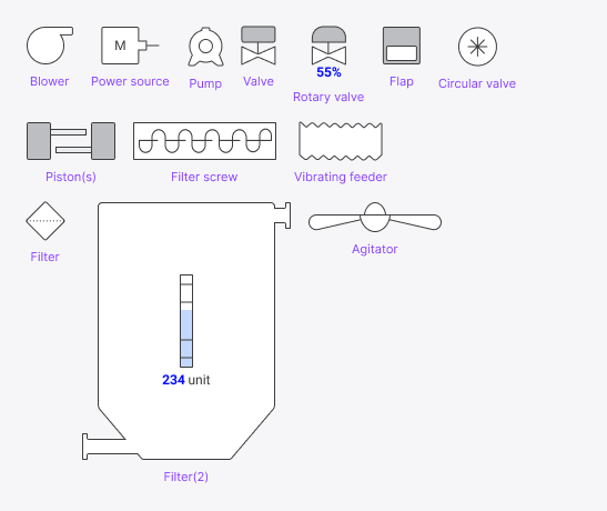
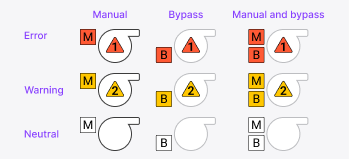
UI design was very much component-driven. We already started sketching some HP HMI components during the research phase, but during UI design, there was a dedicated designer working on the UI libraries while I and 2 colleagues worked on screen mock-ups. I was also responsible for the design backlog and QA for the entire team. Specifically for components, I often did a first draft sketch and documented component states and variations.

STEFANOS MONASTIRIDIS
0032485654553 STEFANOS@STMN-DESIGN.COM
LINKEDIN