BPOST
2023 - 2024
DS OWNER
EUROCONTROL
2022 - 2023
DS CONSULTANT
FLUXYS
2021 - 2024
UI DESIGNER

Wrap DS

Logo of Wrap, the design system of BPOSTAlternative Logo of Wrap, the design system of BPOST

Context

BPOST is the national Belgian postal carrier, together with other subsidiaries, forming bpostgroup. BPOST itself has over 26.000 employees and over 10M customers and potential users of their applications and websites.

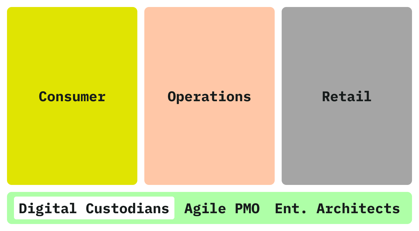
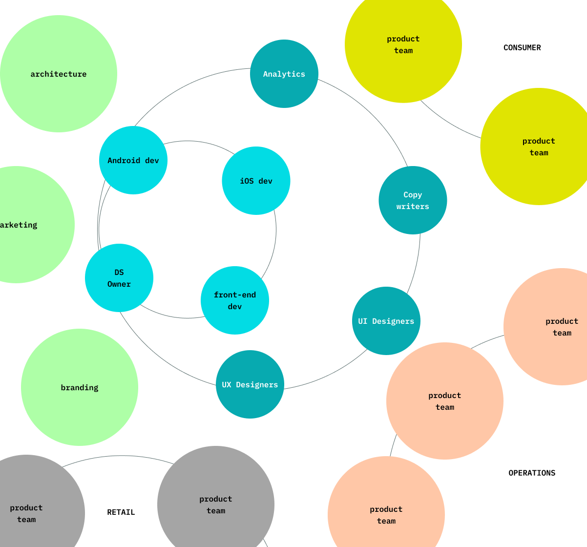
Apart from consumer facing touch points, BPOST develops also a handful of other digtal products used in operations, HR and retail. I can easily count more than 10 distinct "products" and a plethora of technologies.

Three vertical colored rectangles labeled Consumer, Operations, and Retail above a green horizontal bar containing the labels Digital Custodians, Agile PMO, and Ent. Architects. Visualising the organisational context of the Design System team
Stakeholder map of the design system team at bpost. The diagram represents the. core team at the center, with other teams and stakeholders in the periphery

The DS team belonged to the wider team of Digital Custodians, offering digital competences (DS/UX/UI/Analytics/Copy) to product teams across 3 tribes. This is were Wrap DS was born.

Key responsibilities

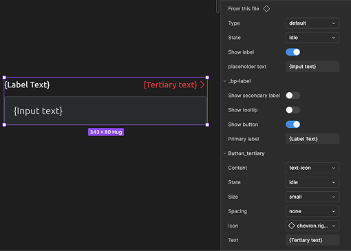
  • Setting up and maintaining Figma libraries and design tokens.

  • UI Design and component specification.

  • Backlog management and roadmapping.

  • Stakeholder relations.

  • Design System architecture.

Design System purpose and principles

The purpose of the design system was to codify and share product design decisions across the bpostgroup and its shape and form was highly informed by the following principles.

Platform parity

Maintain, to the level that is viable, identical naming conventions, structures and attributes across platforms (Figma, Angular, iOS, Android).

Respect the natives

Do not override native UI patterns for the shake of consistency. Leverage the conventions of each platform to create predictable and trustworthy behaviours. Local coherence over global consistency.

Adoption is a spectrum

Enable the design system users to ingest the design system according to their needs and context.

Legacy

Respect the design and tech decisions that came before as long as they do not pose a risk to UX. Adopt existing organisational rituals before inventing new ones. Incremental change over radical innovation.

Input/Output map

A diagram representing the main technical parts of the BPOST design system and their relations

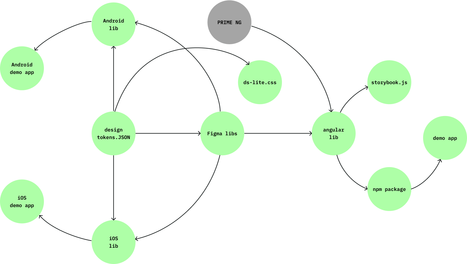
Design decisions are encoded to design tokens in a single JSON file and semi-automatically translated into styles and variables for the following platforms:

  • Figma
  • Angular
  • iOS
  • Android

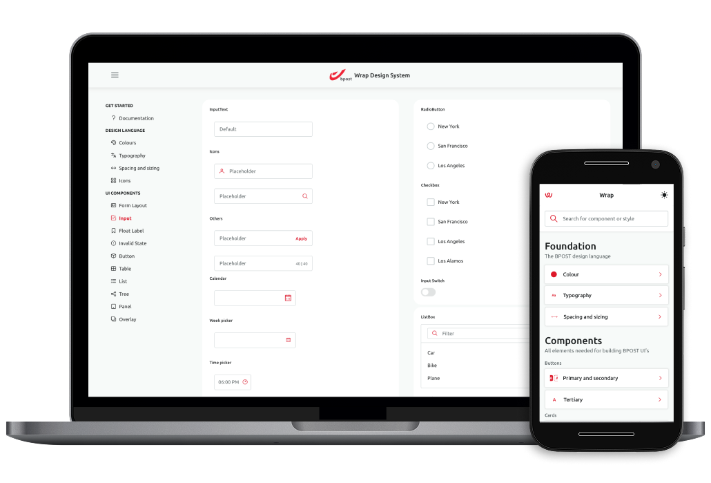
The Figma libraries contain designs of components and their specifications. The developers turn the components in code and add them to their platform-specific libraries. The use of components is demonstrated in demo applications in all platforms and Storybook (Angular only). Prime NG is a dependency of the Angular library.
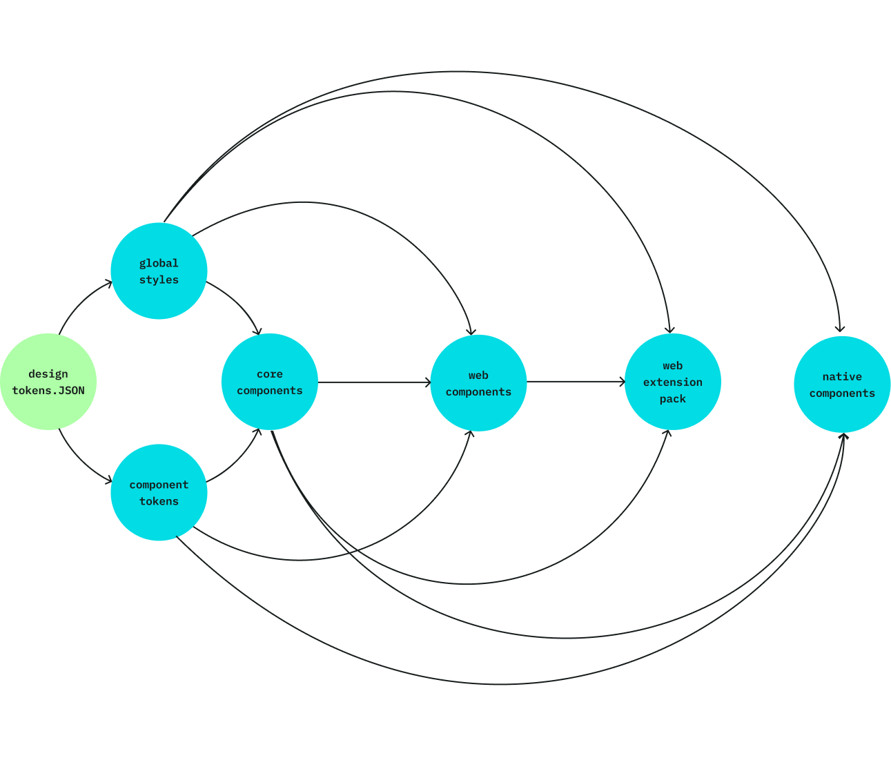
Figma libraries

Flowchart with seven interconnected nodes labeled design tokens.JSON, global styles, component tokens, core components, web components, web extension pack, and native components, showing directional arrows between them.

Common design decisions are translated into variables and styles in global styles library. An additional library, component tokens stores dark mode overrides for components with accessibility issues caused by the default global styles. The global styles library is public and used by designers, while component tokens is only published for the design system team.

Global styles and component tokens are used in all component libraries:

  • Core components includes components common across platforms such as icons.
  • The other component libraries are platform specific and use core components as a dependency.
  • An additional web extension pack library is hosting components used only in applications of a specific user segment

Design tokens

A screenshot from Token Visualizer displaying an example of the design token architecture of Wrap DS, highlighting the primary colour A screenshot from Token Visualizer displaying an example of the design token architecture of Wrap DS

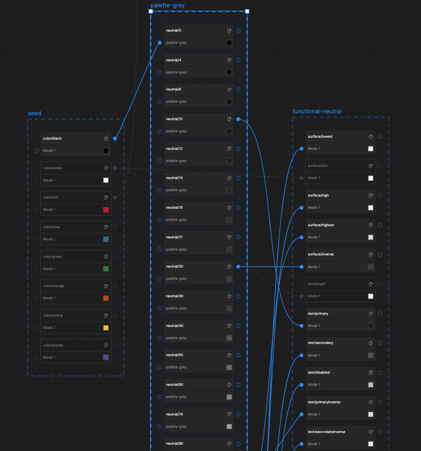
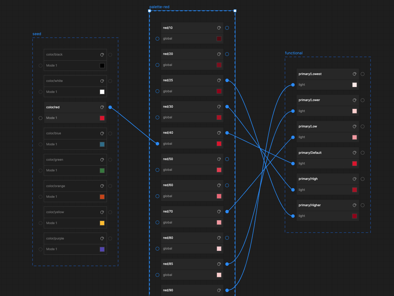
Colour related design decisions were encoded in a multi-tier token architecture, supporting light and dark modes:

  • seed: legacy colours as defined by the BPOST brand.
  • palettes: lighter and darker hues of the seed colours.
  • functional: design tokens picked from the palettes and assigned a specific use such as primary, surface, outline and text.

For functional colour I used a naming convention based on Google Material. Each functional colour has variants from lowest to highest contrast with the background. For example: primaryLow, primaryDefault, primaryHigh. Functional colour was the only tier exposed and used by the designers.

Work organisation

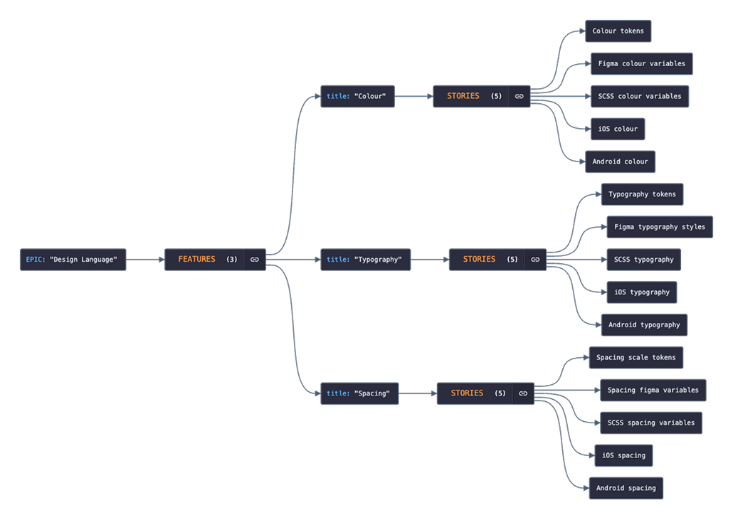
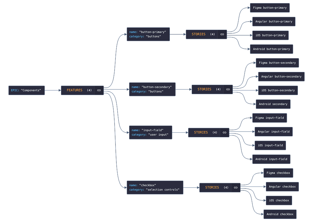
At the highest level, we grouped our work in the following epics:

  • Design Language: All work encompassing the expression of the BPOST brand in its digital channels.
  • Components: All work encompassing standardising solutions to UI problems such as representing actions, presenting options to users, enabling data input etc.
  • Patterns: All work encompassing defining and illustrating best practices for user task completion such as logging in, filling in long forms, manipulating tabular data etc.
  • Documentation: All work leading to the  provision of textual guidance about the correct usage of the design system and its parts.
  • Automation: All work aiming to a seamless design integration and code deployment of the design system such as setting up CI pipelines for design tokens, npm package release, testing etc.
  • User Experience: All work related to the identification and implementation of initiatives that improve the usage of the design system by designers and developers.
A diagram representing the BPOST design system work break down into epics

We defined design system features as “any addition to the design system, that brings substantial value to its users, regardless of their platform”.

Our definition was informed by the principle of platform parity, also referred to as stack mirroring; a feature is not complete if not available both to designers and developers.

The following diagrams represent examples of work breakdown in features and stories.

A diagram representing a part of the work break down of the design language epicA diagram representing an example of work break down in features and stories for the epic "Components"

Outputs

Screenshots of design system demo applications for web and native
Screenshot from Figma showing a banner component and its API
Screenshot from Figma showing a input field component and its API
Screenshot from Figma showing a button component and its API
Documentation of colour for BPOST design system