STANLEY
/STELLA
2025
IA / UX / UI
CARMEUSE
2021 - 2023
DESIGN LEAD
DEMATIC
2020 - 2021
DESIGN LEAD

Intranet redesign

INTRO

Stanley / Stella (ST/ST) requested support in redesigning and deploying their Intranet site, as its owners felt the current version did no longer meet their needs. This was a brief project of 18 days.

Modern showroom with colorful fabric samples arranged in a spiral in the foreground and racks displaying various clothing items near large windows.

Key responsibilities

  • Design team of one

  • Research

  • IA  / UX / UI

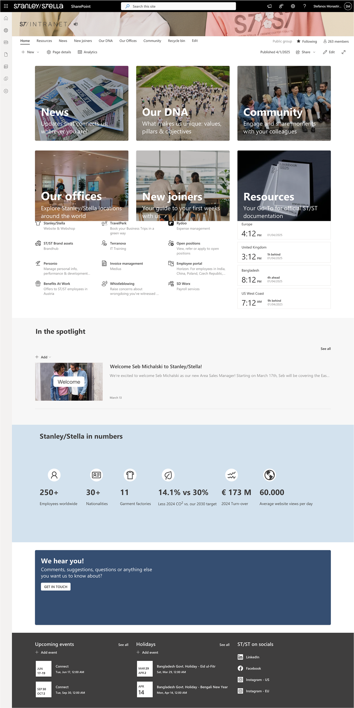
  • Implementation in SharePoint. 

Company intranet homepage with sections for People, Innovation and Excellence, Sustainability updates, branch offices, quick links, and a newsletter image of two smiling coworkers at a table.
Intranet homepage before the redesign

APPROACH

The work in the project included the following activities

  • Expert review of current Intranet
  • User workshop
  • Information architecture
  • Redesign
  • User testing
  • Deployment

EXPERT REVIEW

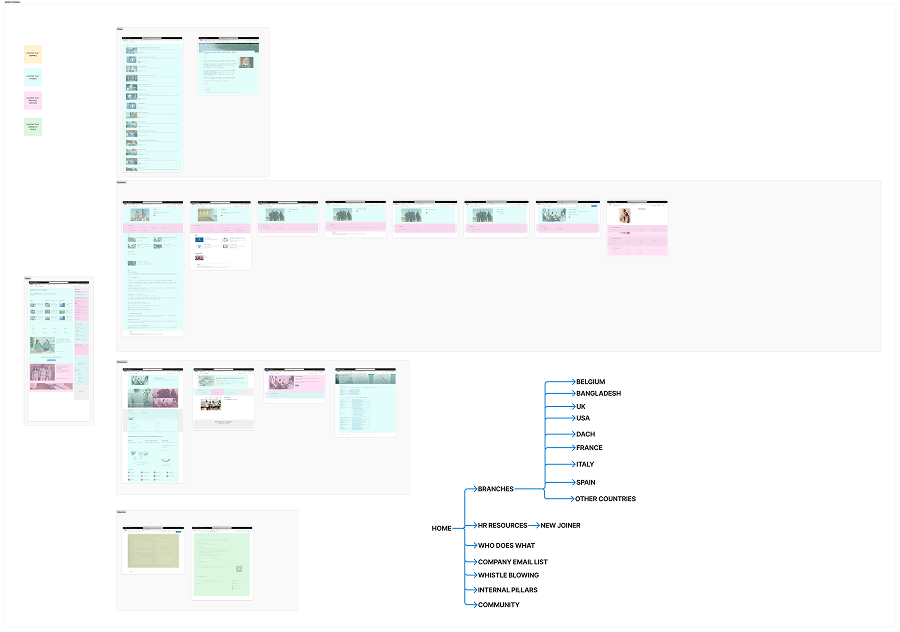
For the expert review I did the following:

  • Create a hierarchical diagram of the current site structure
  • Identify content types based on the classification of internal communication content as
    • Content that informs
    • Content that inspires
    • Content that connects people
    • Content related to (internal) services
Flowchart-style diagram showing a software interface with multiple screenshots arranged in groups, connected by a sitemap-like structure listing sections such as Home, Branches with country names, HR Resources, and Community.
Expert review board (Figjam)

The expert review produced the following insights:

  • There is an uneven distribution of content types both in terms of volume and page they belong to.
  • There is a difference in user experience according to office the user belongs to. While the employees in Brussels and the headquarters use the homepage to get access to services, the other offices have a dedicated page for it.
  • This approach also creates a lot of pages with little use. Given that ST/ST is growing, with new offices opening worldwide, the number of pages will explode.

User workshop

To compliment my own insights, I organised and facilitated a user workshop, featuring Stanley/Stella employees from different departments. In order to select the participants, I presented to my project manager a set of characteristics and asked her to identify people that meet both ends of each.

Four participant profiles showing roles and sliders for years of experience, tech literacy, organizational citizenship, thinking orientation, and initiative orientation.
Example from the participant profiling exercise (Figjam)

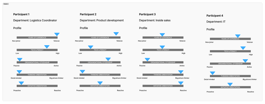
The workshop lasted one hour. To abstract the technical layer of the Intranet and enable the participants to focus on purpose and content of different pages, I used the metaphor of a building. I presented to the participants a set of "rooms", each one serving a different function. I asked the participants to select the rooms they see fitting to include in the intranet, or invent new ones. In the seconda part of the exercise, I asked them to fill their 'building' with content, using the same typology I used in my expert review.

Three side-by-side office and library scenes with colorful sticky notes showing workshop results on company communication and content themes.
Digitised workshop results

Key insights derived from the workshop:

  • There is a clear need of understanding where to find what in the Intranet.
  • There is a need of a single space for all official structured content and documentation.
  • There were a lot of ideas for more informal content and a space for horizontal communication between colleagues. 

Redesign

The combined insights from expert review and user workshop informed the key decisions that drove the redesign of the Intranet:

  • Simplified structure with 6 primary pages, each one serving a specific purpose
  • Leveraged Share Point features of audience targeting, in order to customise content such as links to policies and news according to what is relevant for each office.
  • Introduced the use of Viva Engage / Yammer in order to create global and local community spaces encouraging horizontal communication.

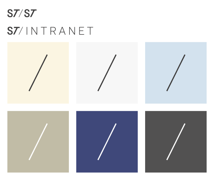
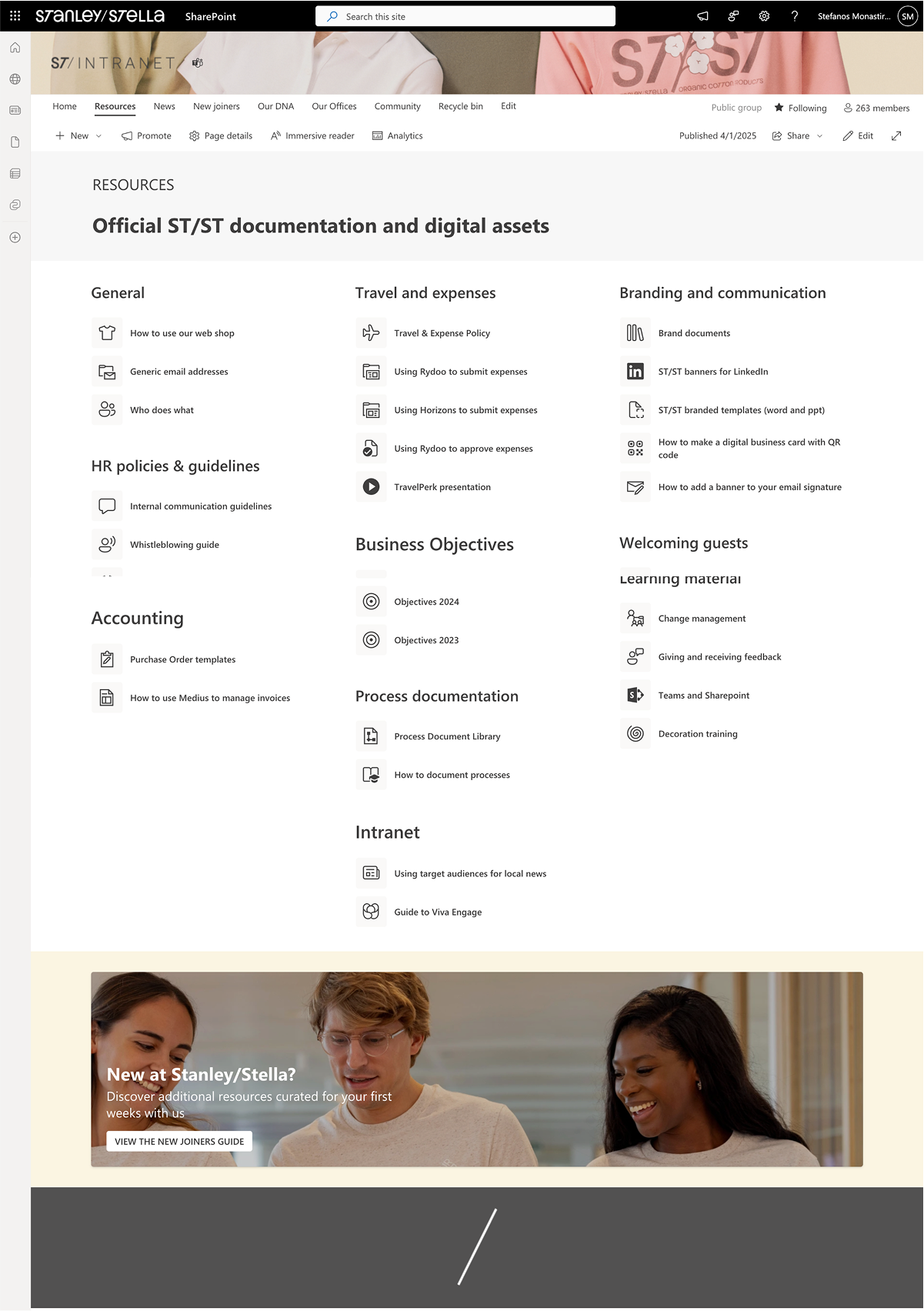
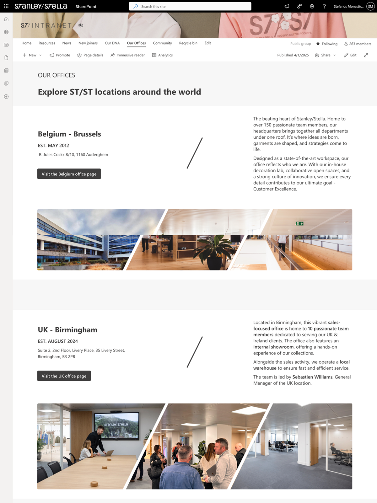
My visual approach was based on the use of diagonal of the Stanley/Stella logo as a decorative element and the combination of neutral greys with colors from their clothes collection to create a dynamic yet familiar look & feel.

ST logo and the word INTRANET with six colored squares below, each containing a diagonal slash symbol in varying colors. Visual style tiles
Redesign style tile

Stanley/Stella SharePoint intranet homepage showing navigation menu, main sections for News, Our DNA, Community, Our offices, New joiners, Resources, company stats, welcome message, and upcoming events.SharePoint page of Stanley/Stella intranet showing resources for documentation, policies, accounting, travel, branding, business objectives, and welcoming guests, with a banner image of three smiling young adults.ST/ST intranet page showing office locations in Belgium Brussels and UK Birmingham with images of office buildings and teams.

Client feedback

Stefanos leveraged the SharePoint functionalities to create features in the Intranet we did not know were feasible (using target audiences to provide dynamic content to user according to location, implementing community features via Viva Engage). There was a shift during the project from ‘not possible’ to ‘let’s see what we can do’, finding quick wins  along the way and delivering the simplification we needed. He also came with ideas and challenged us while at the same time he took our feedback into account. We feel that the end product pushed SharePoint to its limits in terms of look & feel.